Heuristic Evaluation
Dr. Andrew Besmer
Heuristic Evaluation
Heuristic Evaluation
- Heuristic Evaluation is a discount usability technique
- Developed by Jakob Neilsen
- Find problems in a user interface design
- Small set of evaluators evaluate based on usability principles (“heuristics”)
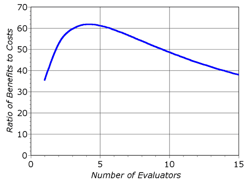
- One case study showed cost benefit ratio of 1:48!
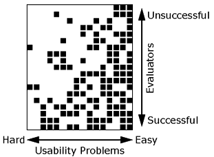
Finding Problems
- Hard for a single evaluator to find all
- 19 evaluators find 16 problems in voice response system for bank
- Easy problems found by many evaluators
- Hard problems identified by those not finding many
Evaluators
Evaluators
- Nielsen recommends 3-5 because of diminishing returns
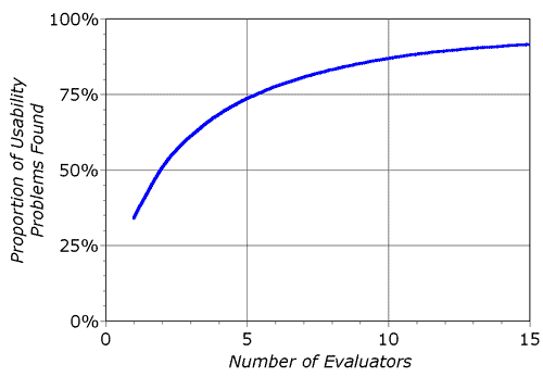
Evaluators
Performing
- Evaluator inspects interface alone
- Communication only when finished to aggregate
- In user study, typically want users to answer questions through exploration
- In HE, evaluator questions may be answered
- May not be domain experts
- Evaluator time valuable
- Generally not given hints unless they ask or are clearly in need
Performing
- Typical HE lasts 1-2 hours
- If longer needed, consider splitting into multiple sessions
- Evaluator goes through several times comparing interface to the heuristics
Reporting
- Reported with:
- Written report by each evaluator
- Formal record
- Read/aggregated by an evaluation manager
- Verbalization to an observer
- Increase overhead reduced evaluator burden
- Potentially faster results as no report by each
- Written report by each evaluator
Output
- Output is list of usability problems
- Reference those heuristics which were violated
- Can not just say you do not like
- Be specific and list each separately
- Risk reintroducing the problem when another is solved
- May not be possible to fix that specific one but related ones might be fixable
Debrief
- Sometimes might be worth debriefing
- What went well is not covered
- Discussion of possible design solutions
Heuristics
Heuristics
- Neilsen/Norman Group provides 10 well known usability heuristics
Visibility of System Status
- Users should understand current system status
- Facilitates learning outcomes of prior interactions to determine next steps
- Tips
- Communicate clearly system state
- Present feedback quickly, ideally immediately
- Build trust through continuous communication
Match System & Real World
- Design should “speak” users language
- Words, concepts, phrases
- No internal jargon
- Use natural mapping when possible
- Tips
- Users don’t need to look up definitions
- Don’t assume your understanding = users
- Perform user research to understand mental models, familiar terminology
Match System & Real World
User control and freedom
- Users make mistakes, provide clearly marked “emergency exit”
- Allows users to feel like they remain in control of system, reduces frustration
- Tips
- Support Undo and Redo
- Show a clear way to exit, e.g. Cancel button
- Exit clearly labeled and discoverable
Consistency & Standards
- Users shouldn’t have to wonder whether different words, situations, actions mean same thing
- Follow platform and industry conventions
- People spend most of their time using systems other than yours
- Failing to do so increases cognitive burden
- Tips
- Consider internal and external consistency
- Follow established conventions
Error Prevention
- Good error messages important but preventing errors is better
- Eliminate error prone conditions or check for them
- Slips - Unconscious errors
- Mistakes - Conscious errors based on mismatch between mental model and design
Error Prevention
- Tips
- Prioritize high-cost errors first, then frustrations
- Avoid slips by providing helpful constraints and good defaults
- Prevent mistakes by reducing or removing memory burdens, warning users, providing undo
Recognition Over Recall
- Minimize user memory load
- Actions, elements, options visible
- Avoid memory carryover from one part of interface to another
- Information required to use design visible (e.g. labels)
- Tips
- Offer help in context
- Reduce information that needs to be remembered
Flexibility & Efficiency of Use
- Provide shortcuts
- Hidden from novice users
- Experienced and Inexperienced Users can interact
- Tips
- Provide accelerators e.g. keyboard shortcuts
- Provide personalization
- Allow for customization
Aesthetic Minimalist Design
- Do not have irrelevant or rarely needed information on interfaces
- Extra information competes with relevant and reduces visibility
- Ensure visual elements of interface support users primary goals
- Tips
- Focus on essential content and visual design
- No unnecessarily distracting elements
- Prioritize content and features that support primary goals
Help Users With Errors
- Help Users Recognize, Diagnose, Recover From Errors
- Error messages should
- Be expressed in plain language (no error codes)
- Precisely indicate problem
- Constructively suggest solution
- Presented so they will be noticed/recognized
Help Users With Errors
- Help Users Recognize, Diagnose, Recover From Errors
- Tips
- Use traditional/redundant visuals like bold red text
- Red alone not enough
- Tell users what went wrong in their language, avoid jargon
- Offer users a solution
- Use traditional/redundant visuals like bold red text
Help and Documentation
- Best if system doesn’t need any explanation
- Still provide documentation to help users understand how to complete their tasks
- Should be
- Focused on user’s task
- Concise
- List concrete steps
- Tips
- Provide searching
- Present in context when possible
- List steps to be carried out
Questions
Questions
- Questions?